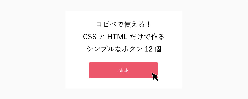
こんにちは!ANDSPACE コーダーの足立です。
今回は以前の記事に引き続き、CSSとHTMLのみを使った、HTML・CSS初心者でもコピペで使用できるボタンのデザインを掲載していきたいと思います。
ベーシック
ボタンデザイン
HTML
<a class="btn type01" href=""">ボタンデザイン</a>css
.btn.type01{
width: 100%;
max-width: 340px;
padding: 15px 10px;
display: inline-block;
text-align: center;
letter-spacing: 0.1em;
color: #fff;
background-color: #ed576c;
}
立体的
ボタンデザイン
<a class="btn type02" href=""">ボタンデザイン</a>css
.btn.type02{
width: 100%;
max-width: 340px;
padding: 15px 10px;
display: inline-block;
text-align: center;
letter-spacing: 0.1em;
color: #fff;
background-color: #ed576c;
border-bottom: 4px solid #c5394d;
border-radius: 5px;
}
シャドウ
ボタンデザイン
<a class="btn type03" href=""">ボタンデザイン</a>css
.btn.type03{
width: 100%;
max-width: 340px;
padding: 15px 10px;
display: inline-block;
text-align: center;
letter-spacing: 0.1em;
color: #fff;
background-color: #ed576c;
box-shadow: 0 5px 10px 0 rgba(0,0,0,.12), 0 3px 20px 0 rgba(0,0,0,.12), 0 5px 6px -2px rgba(0,0,0,.2);
-webkit-tap-highlight-color: transparent;
border-radius: 5px;
}
斜体
ボタンデザイン
<a class="btn type04" href=""">ボタンデザイン</a>css
.btn.type04{
position: relative;
width: 100%;
max-width: 340px;
padding: 15px 10px;
display: inline-block;
text-align: center;
letter-spacing: 0.1em;
color: #fff;
.btn.type04:after{
content: "";
width: 100%;
height: 100%;
position: absolute;
left: 0px;
top: 0px;
background-color: #ed576c;
z-index: -1;
transform: skew(-10deg);
}
発光
ボタンデザイン
<a class="btn type05" href=""">ボタンデザイン</a>css
.btn.type05{
width: 100%;
max-width: 340px;
padding: 15px 10px;
display: inline-block;
text-align: center;
border-radius: 30px;
letter-spacing: 0.1em;
color: #fff;
font-smoothing: antialiased;
-webkit-font-smoothing: antialiased;
-moz-font-smoothing: antialiased;
background-color: #ed576c;
background-size: 200% auto;
-webkit-box-shadow: 0 0 10px #ed576c;
box-shadow: 0 0 10px #ed576c;
}
グラデーション
ボタンデザイン
<a class="btn type06" href=""">ボタンデザイン</a>css
.btn.type06{
width: 100%;
max-width: 340px;
padding: 15px 10px;
display: inline-block;
text-align: center;
border-radius: 30px;
letter-spacing: 0.1em;
color: #fff;
font-smoothing: antialiased;
-webkit-font-smoothing: antialiased;
-moz-font-smoothing: antialiased;
background-image: -webkit-gradient(linear, left top, right top, from(#e88bf3), color-stop(51%, #ed576c), to(#e88bf3));
background-image: -webkit-linear-gradient(left, #e88bf3 0%, #ed576c 51%, #e88bf3 100%);
background-image: -o-linear-gradient(left, #e88bf3 0%, #ed576c 51%, #e88bf3 100%);
background-image: linear-gradient(to right, #e88bf3 0%, #ed576c 51%, #e88bf3 100%);
background-size: 200% auto;
}
2色
ボタンデザイン
<a class="btn type07" href=""">ボタンデザイン</a>css
.btn.type07{
position: relative;
width: 100%;
max-width: 340px;
padding: 15px 10px;
display: inline-block;
text-align: center;
letter-spacing: 0.1em;
color: #fff;
}
.btn.type07:before{
	content: "";
	width: 100%;
	height: 100%;
	position: absolute;
	left: 0px;
	top: 0px;
	width: 0;
	height: 0;
	border-style: solid;
	border-width: 54px 340px 0 0;
	border-color: #d64e62 transparent transparent transparent;
	z-index: -1;
}
.btn.type07:after{
	content: "";
	width: 100%;
	height: 100%;
	position: absolute;
	left: 0px;
	top: 0px;
	background-color: #ed576c;
	z-index: -3;
}
ボーダー
ボタンデザイン
<a class="btn type08" href=""">ボタンデザイン</a>css
.btn.type08{
width: 100%;
max-width: 340px;
padding: 15px 10px;
display: inline-block;
text-align: center;
letter-spacing: 0.1em;
color: #ed576c;
border: 2px solid #ed576c;
}
上下線
ボタンデザイン
<a class="btn type09" href=""">ボタンデザイン</a>css
.btn.type09{
width: 100%;
max-width: 340px;
padding: 15px 10px;
display: inline-block;
text-align: center;
letter-spacing: 0.1em;
color: #ed576c;
border-top: 2px solid #ed576c;
border-bottom: 2px solid #ed576c;
}
四隅
ボタンデザイン
<a class="btn type10" href="""><span>ボタンデザイン</span></a>css
.btn.type10{
position: relative;
width: 100%;
max-width: 340px;
padding: 15px 10px;
display: inline-block;
text-align: center;
letter-spacing: 0.1em;
color: #ed576c;
}
.btn.type10:before,.btn.type10:after{
	content: "";
	width: 10px;
	height: 10px;
	border-right: 2px solid #ed576c;
	border-top: 2px solid #ed576c;
	position: absolute;
	right: 0px;
}
.btn.type10:before{
	top: -2px;
}
.btn.type10:after{
	bottom: -2px;
	transform: rotate(90deg);
}
.btn.type10 span:before,.btn.type10 span:after{
	content: "";
	width: 10px;
	height: 10px;
	border-left: 2px solid #ed576c;
	border-top: 2px solid #ed576c;
	position: absolute;
	left: 0px;
}
.btn.type10 span:before{
	top: -2px;
}
.btn.type10 span:after{
	bottom: -2px;
	transform: rotate(-90deg);
}
罫線
ボタンデザイン
<a class="btn type11" href="""><span>ボタンデザイン</span></a>css
.btn.type11{
position: relative;
width: 100%;
max-width: 340px;
padding: 15px 10px;
display: inline-block;
text-align: center;
letter-spacing: 0.1em;
color: #ed576c;
}
.btn.type11:before,.btn.type11:after{
	content: "";
	width: 105%;
	height: 2px;
	background-color: #ed576c;
	position: absolute;
	left: 50%;
	transform: translateX(-50%);
}
.btn.type11:before{
	top: 0px;
}
.btn.type11:after{
	bottom: 0px;
}
.btn.type11 span:before,.btn.type11 span:after{
	content: "";
	width: 2px;
	height: 120%;
	background-color: #ed576c;
	position: absolute;
	top: 50%;
	transform: translateY(-50%);
}
.btn.type11 span:before{
	left: -2px;
}
.btn.type11 span:after{
	right: -2px;
}
点線
ボタンデザイン
